Thought I'd revamp my Bio, converting it into a more visual and fun
format as some bio's can be rather boring and time consuming to read
through....
All part of my new responsive web-site that will be live early in the New Year!
Tuesday, 17 December 2013
Thursday, 12 December 2013
Cow Gum and Magic Markers
If you are of a certain age and you frequented graphic design studios before Apple Macs made their appearance, then I'm sure you will remember the pungent smell of Cow Gum and the colourful arrays of Magic Markers, scalpels in abundance, yellow lighter fuel canisters and sheets of Letraset.
Cow gum was a solvent based latex glue packaged up in it's distinctive red and white tin. It was great for sticking your artwork together as it didn't cause paper to wrinkle like water based glues would, it also had the disadvantage that it would end up where you didn't want it to! Graphic designers across the globe had great fun rolling the glue into balls and chucking it across the office whilst involuntary (or voluntary) getting high on the fumes at the same time.
I can still remember the smell I experienced when entering agencies' premises, its the type of smell you never forget..
Often next to the Cow Gum was a very expensive set of Magic Markers, either arranged in neat order, or as I usually saw, strewn across the desk and surrounding area. To complement Cow Gum the markers had their own unique 'volatile' smell and squeaky noise when used, they came in chubby bottles with fat felt tips. I miss those great scamps that were created using these markers, there was greater scope for interpretation of the brief and a really good showcase for the artistic talents of the graphic designer. I also think that the thought process works far better for creating ideas with sketching pen to paper, rather than recycling images on a computer. These great illustrations are virtually extinct now, which is a shame. I still find myself sketching out ideas in front of clients (using pencils and a large layout pad), not only to show what I'm thinking of, but to also explore possibilities before the shoot commences.
Don't forget those Pantone Colour Specifier swatches either. Sheets of lots of little coloured squares that can be torn off along the perforations. No design studio should have be without.
As for Letraset (dry transfer lettering), well that is something I never really liked at all, tedious to apply and generally annoying to use, and you can still buy it!
Cow gum was a solvent based latex glue packaged up in it's distinctive red and white tin. It was great for sticking your artwork together as it didn't cause paper to wrinkle like water based glues would, it also had the disadvantage that it would end up where you didn't want it to! Graphic designers across the globe had great fun rolling the glue into balls and chucking it across the office whilst involuntary (or voluntary) getting high on the fumes at the same time.
I can still remember the smell I experienced when entering agencies' premises, its the type of smell you never forget..
Often next to the Cow Gum was a very expensive set of Magic Markers, either arranged in neat order, or as I usually saw, strewn across the desk and surrounding area. To complement Cow Gum the markers had their own unique 'volatile' smell and squeaky noise when used, they came in chubby bottles with fat felt tips. I miss those great scamps that were created using these markers, there was greater scope for interpretation of the brief and a really good showcase for the artistic talents of the graphic designer. I also think that the thought process works far better for creating ideas with sketching pen to paper, rather than recycling images on a computer. These great illustrations are virtually extinct now, which is a shame. I still find myself sketching out ideas in front of clients (using pencils and a large layout pad), not only to show what I'm thinking of, but to also explore possibilities before the shoot commences.
Don't forget those Pantone Colour Specifier swatches either. Sheets of lots of little coloured squares that can be torn off along the perforations. No design studio should have be without.
As for Letraset (dry transfer lettering), well that is something I never really liked at all, tedious to apply and generally annoying to use, and you can still buy it!
Tuesday, 22 October 2013
Village Butcher Retiring
![]() |
There is no other butcher in the village, so if there are any budding butchers out there who like the idea of taking over the shop then why not give Barry a ring 01582 792279. He will close up shop in the beginning of November.
http://www.redbourn.org.uk/Redbourn/HallW
Friday, 18 October 2013
Plums
Tuesday, 8 October 2013
Japanese Crackers
Friday, 16 August 2013
The Fire Pit
A short video I made of a fire pit in the depths of the Canadian countryside. This looks best in high definition but I hope you enjoy this low res version.
Make yourself comfy, watch the flames and listen to the night sounds!
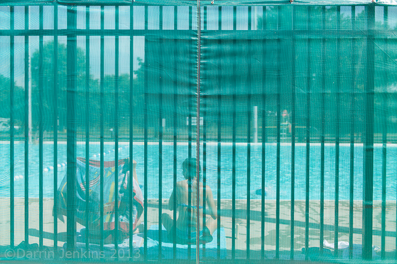
Holiday Photos
I've just returned from a couple of weeks visiting my cousins in Canada, and have added a few photos from my trip to the blog.
![]() |
| Pool |
![]() |
| CN Tower Toronto Canada |
![]() |
| Downtown Toronto |
![]() |
| Red Trousers Niagra Falls |
![]() |
| Niagra falls Canada |
![]() |
| Niagra falls Canada |
![]() |
| "Dream Home" |
![]() |
| Red Hat |
![]() |
| Niagra Bikers Canada |
![]() |
| A sign that sells itself |
Wednesday, 26 June 2013
Diptych Photograph
You may not have heard the term Diptych, but my latest photography idea was to create one.
According to Wiki a Diptych is: "a photograph that uses two different or identical images side by side to form one single artistic statement. The two images can literally be in contact with each other, or separated by a border or frame".
So there you go, here's my Diptych below.
According to Wiki a Diptych is: "a photograph that uses two different or identical images side by side to form one single artistic statement. The two images can literally be in contact with each other, or separated by a border or frame".
So there you go, here's my Diptych below.
Monday, 17 June 2013
I've rummaged around and found some old photographic bulbs in the studio.
![]() |
| Photographic bulbs |
If anyone would like a print, let me know and I'll sort one out for you. The 160mb image will easily print big btw....
Thursday, 13 June 2013
Light and Dark Chocolate with Hazelnuts & Pistachios
Tuesday, 21 May 2013
Cognac splash in Glass
![]() |
| Splashing Cognac in glass |
| Not only do I like the splash but I also like the folded paper background and the way the light is hitting it. High speed flash....http://www.dj-photo.com/gallery/still-life-and-product-photography |
Thursday, 16 May 2013
Remy Martin Cognac - not a straight photo by a long way
![]() |
| Remy Martin Cognac |
The light streaks were created in Photoshop, using the Path tool, layer effects and custom brushes. This technique has no shortage of options, it is possible to end up with so many various styles which can suit just about any subject!
![]() |
| Photography set up for the bottle shot |
Camera: Linhof M679 CS
Digital Back: Phase One IQ180 (80million pixels)
Lens: Schneider Apo-Digitar 120mm Macro
More shots like this coming soon!
Subscribe to:
Posts (Atom)